How to create a correlation heatmap in python
and some specialities for mutual funds data
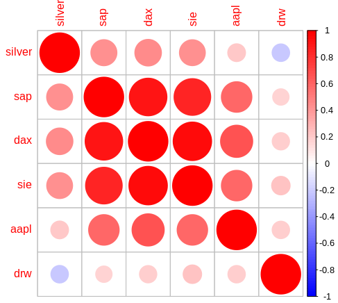
After introducing the correlation matrix and heatmap in R I’ll show you here how to perform this task in python. See for yourself which code suits you better.
For the correlation in python I programmed the following three notebooks. The differences lie mainly in the data supply.
- correlation-in-python.ipynb: The basic python notebook that uses the same input data as the corresponding R example.
- correlation-ip-yfin.ipynb: The correlation in python that uses the yfinance API as data source.
- correlation-ip-fonds.ipynb The correlation in python example that uses data from ARIVA and adds some mutual funds.
Let’s start with the first notebook for the direct comparison to the correlation-in-R: The data is read from CSV files containing the columns ‘Date’ and ‘Close’. To have comparable data (i.e. every data set contains the same date-values) I merged the input files into the merged_quotes pandas dataframe. To keep the R code clean I manually merged the files there. But with pandas this can be done on the fly:
merged_quotes = pd.merge(merged_quotes, quotes, on='Date')If you want to check your merged data afterwards you should use the parameter ‘suffixes’ on the merge. Otherwise the columns will be named ‘Close_x, Close_y, Close_x, Close_y, …’. For the same reason I renamed the columns afterwards.
For the correlation matrix we need the percent changes from one day to the next. In the R-code this was “manually” done by the function getPVector (get performance vector). My Python code does this by applying pct_changes() to the complete dataframe (except for the column ‘date’, which was formerly dropped of course).
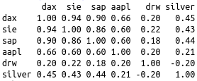
corr() calculates the correlation matrix on the percent changes.
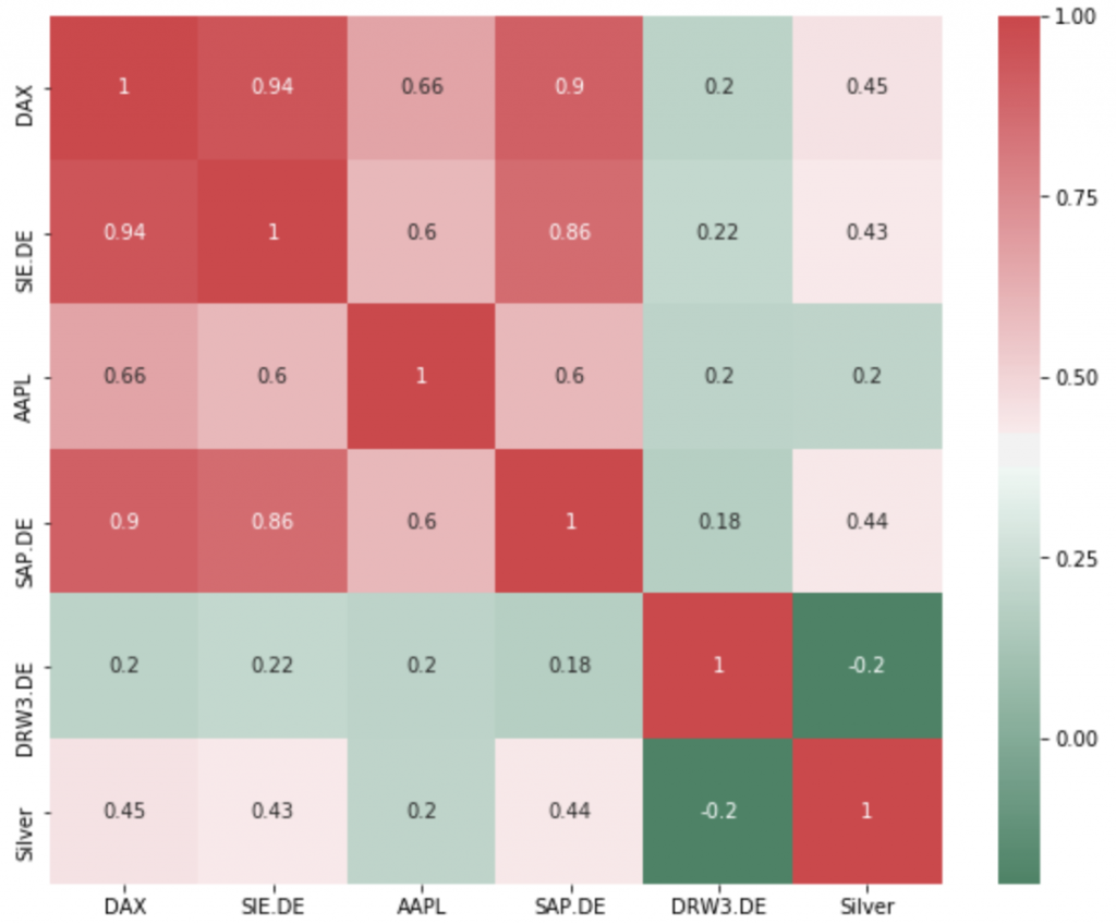
For the visualisation I used the easy to handle seaborn heatmap with a colour palette range from green to red. The parameter annot=True prints the correlation values in each square. If you prefer colours from blue to red you can simply replace the cmap by the value ‘coolwarm’.

The second code ‘correlation-ip-yfin’ loads the data from yahoo finance with the help of the yfinance api as described in my first post. Because it was so easy loading some more sets I made the entries list rather long. The fact that you only find a few really low correlations when using a 3-months-history is very interesting. And if you’re only looking at the correlation, the only suitable addition for any stock portfolio seems to be Drägerwerk, not only since the beginning of the corona crisis. But don’t forget to consider the performance.
The third notebook ‘correlation-ip-fonds.ipynb’ loads mutual funds and ETF data from previously downloaded files from ARIVA.DE. To retrieve the data remove the *.csv-files from the data-funds directory and execute the scripts there:
getQuotes.shto download the data as [wkn]_historic.csv. You can use min_date and max_date to retrieve a certain period of data (e.g.getQuotes.sh 19.09.2019 03.04.2020)revertFiles.shto convert the data in usable format (date and close, order: from old to new)
This code has one special feature: after the first runs I realised that the ÖKOWORLD funds had a surprisingly low correlation. A closer look revealed that they apparently report their values one day later. So the data from these funds must be shifted by one day.
The funds are surprisingly high correlated. Even the MSCI World, the Emerging Markets and the Scandinavian funds. If you happen to find high-performance funds with lower correlations or an API for easier funds-data-download, please let me know.


