Pick your stocks by Correlation –
Develop and visualise your portfolios’ correlation matrix in R
Modern portfolio theory has proven the fact that adding stocks with different price movements reduces your portfolios’ overall risk when other factors stay constant (i.e. performance). Stocks that react differently to external influences (e.g. oil price shocks or FED interest rate decisions) are less correlated with each other.
This correlation can be measured with statistical methods. The basic measurement for the joint variability of two variables is the covariance. The standardized measurement is the Pearson correlation coefficient that ranges from -1 to +1. A coefficient of +1 means perfect synchronical movement of both variables in the same direction, while -1 indicates perfect sync in different directions. A coefficient value of 0 states no relationship at all between the movements of both variables.
When looking for uncorrelated stocks as an addition to our existing portfolio we are therefore looking for stocks with small absolute values of their correlation coefficient with any other position in our portfolio. The instrument of choice is the correlation matrix and the visualisation is the correlation matrix’ heatmap.
Both are not hard to implement with some lines of R code.
First we download the historical data for the different stocks as described in the yfinance article and save it in the data directory. The historical data need some steps of preparation:
- align the entries so that we have the same days for all stocks
- remove everything but the close values from the files
Additionally the quotes must be sorted from old to new values (what is given if you download them by yfinance).
For this example I added historical data from silver (ticker symbol SI=F) to show an example of commodity correlation to stocks. Other values you’ll find in the data subdirectory are from common stocks like SAP, Apple and Drägerwerk. (If you find an API to reliably download mutual funds data please let me know).
The code starts by loading the corrplot package for plotting the correlation heatmap. Next is the function getPVector that returns a vector of performance values.
To have comparable values for the stocks we can’t take the raw quotes. But with the daily returns (daily performances) we have comparable movement variables regardless if we consider stocks, indices, funds or commodities. The daily performance is calculated by
\[p_{t}=\left(\frac{quote_{t}}{quote_{t-1}}-1\right)\times100\textrm{ [Performance in %]}\]which equals
\[p_{t}=\frac{quote_{t}-quote_{t-1}}{quote_{t-1}}\times100\]That’s what is implemented in getPVector.
Next there is the function to read the stock quotes (importPVector) and return the performance vectors which is then done by the lines starting with
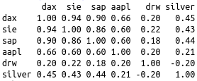
dax <- importPVector("DAX.csv")After importing we combine the vectors to the matrix ‘mat’ and as result retrieve the correlation matrix by using cor(). For better readability this matrix is rounded to two digits. And looks like this:

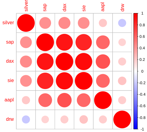
The last two code lines build the correlation matrix’ heatmap.

What do we do with these results?
- The large red circles next to the diagonal identify our portfolios’ cluster risks. We can then think about repositioning in favour for less red circles (i.e. sell combined risks and rebuy positions with less correlations).
- Next we see the fantastic low correlation with the small cap DRW (Drägerwerk) and DAX. The overall correlation with this stock and the other values is even better than the correlation with silver and the other values.
- Check for suitable additions: you can now add and check buying candidates (and if you own large DAX-Index positions it will be clear not to add other large DAX stock positions like Siemens).
- Try to download your ETF or mutual funds’ close values and check single stocks as candidates for correlation. Also check other funds as possible additions for correlation with your existing portfolio.
- Check commodities (gold, silver, oil, …) as add-ons for your portfolio.
- Find a way to reflect the combined position sizes in den heatmap fields (i.e. large circles for large positions, small circles for small positions). Then think about your large red circles in order to reposition your assets.
- But if you find additions with minimum correlation to your existing portfolio positions don’t forget to think about the performance chances of that candidates!
Source
https://github.com/ds4pi/correlation-in-r
Links
Modern Portfolio Theory – systematic and specific risk
Pearson correlation coefficient
https://github.com/taiyun/corrplot
https://cran.r-project.org/web/packages/corrplot/

